Pricing research

How the best SaaS products present add-on pricing

Carepatron is adding two paid add-ons to its pricing page, and they have two very different pricing shapes. E-prescribe is a simple flat monthly fee ($39/mo per prescriber), while Managed Billing is a hybrid (3.9% of collections + $99/mo per provider). The real design question is how to show a percentage-plus-fixed-fee clearly, without it feeling confusing or scary.

We surveyed around 25 pricing pages and checkout flows on Mobbin across web SaaS.

The central tension

Two add-ons, two pricing shapes

One add-on is easy and one is the hard part. A flat per-seat fee is a number people already know how to read. A percentage of collections plus a per-provider fee is two units doing different jobs, and a buyer's first instinct is to ask "so what does it actually cost me?" The whole job of the design is to make the hybrid land as confidently as the flat fee does.

E-prescribe · the easy one
$39/mo per prescriber

A flat monthly fee. One number, one unit. Reads in a glance and needs no explaining.

Managed Billing · the hard one
3.9%of collections+$99/mo

A percentage joined to a per-provider fee. Two units, a variable cost, and the part most likely to read as scary if it is shown badly.

Pattern catalog

Six patterns the field actually uses

Grouped by the job each one does, with the real reference and what we took from it.

Group A · for Managed Billing

The percentage-plus-fee, solved

The hybrid is not a new problem, it is a solved one. The pattern that works every time is to make the percentage the hero numeral and attach the fixed fee with a big "+", under one plain qualifier. The percentage leads because it is the part that scales with the customer's own success; the flat fee rides along in smaller type so it never competes for attention.

Group B · maps to prototype 1

The optional add-ons grid

A labelled "Optional add-ons" header over a small grid of cards is the most common and lowest-risk pattern in the set. It slots in under the plans without disrupting them, it scales to one card or five, and the "optional" framing tells people up front that nothing here is required to start.

Group C · maps to prototype 2

Featuring one add-on

When a single add-on carries the strategic weight, it earns a full banner rather than a card in a grid. The room lets one strong price line, a few proof bullets, and a product visual do the convincing. This is the right shape when you want one add-on to be the thing people remember.

Group D · maps to prototype 3

Modular, attach to your plan

Here add-ons are framed as modules that bolt onto a chosen plan, usually priced per seat and offered with a "+ Add" affordance. The mental model is build-up, not branch-off: pick a plan, then attach what you need. It reads cleanly when add-ons are genuinely composable with the plan beneath them.

Group E · maps to prototype 4

Interactive, build-your-total

Configurators let people toggle add-ons and watch a running total update. They are excellent inside the product, on an upgrade or checkout screen, but heavier than a marketing page usually wants. Worth noting for Carepatron: a variable percentage cannot honestly be folded into one fixed headline number, so a builder has to keep that line separate.

Group F · supporting

Reading a % inside a plan

A percentage does not always need special treatment. It also reads cleanly as a plain feature line inside a plan, and the contrast between tiers (a fee here, none there) can do real selling. A close vertical peer rounds this out by showing the conventional comparison table our buyers already expect.

Read across the set

What this means for Carepatron

Five principles the references point to, applied to our two add-ons.

1

The hybrid is solved

Show Managed Billing as a big "3.9%" hero with "$99/mo per provider" attached by a +, each under a plain qualifier. Stripe, Intercom and PayPal all prove this reads cleanly.

2

A percentage feels friendly when it is compared and explained

Carepatron's 3.9% versus the industry's 6 to 8% that won't even quote a number is a gift. Lead with that transparency rather than hiding the figure.

3

Never merge a variable % into a fixed total

In any configurator, keep "+ 3.9% of collections" as its own noted line, the way Mixpanel keeps usage items separate from the seat total. A single headline number would not be honest.

4

Add-ons want low-commitment language

"Add or remove anytime" and "no long-term contracts" lower the perceived risk, exactly as Intercom does, and both happen to be true for Carepatron.

5

The two add-ons have different sales motions

E-prescribe is self-serve, so its CTA is "Add to plan". Managed Billing is consultative, so its CTA is "Book a 15-min call". Keep the two buttons deliberately different.

Prototypes

The four directions we built

Each one takes a different pattern from the catalog above. Open them to compare in context.

Direction 1

Classic grid

Two cards under the plans. Safest, native fit. Patterns: Webflow / Replit View prototype
Direction 2

Transparent showcase

Managed Billing's 3.9% + $99 as the hero, with the "vs 6 to 8%" transparency hook. Patterns: Stripe / Intercom View prototype
Direction 3

Modular attach-to-plan

Add-ons as modules that bolt onto a plan, per provider. Patterns: Lattice / Framer / Clerk View prototype
Direction 4

Interactive builder

Toggle add-ons and watch a live monthly total. Patterns: Mixpanel / Calendly View prototype
Recommendation

Ship Direction 1 with Direction 2's pricing typography

A clear point of view, not a menu. For the marketing pricing page today, the lowest-risk, highest-clarity move is a blend of the two safest directions.

For carepatron.com/pricing today

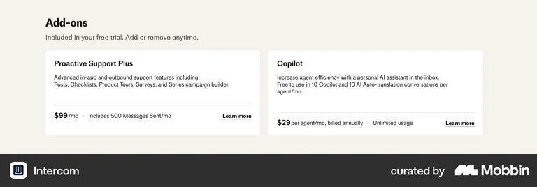
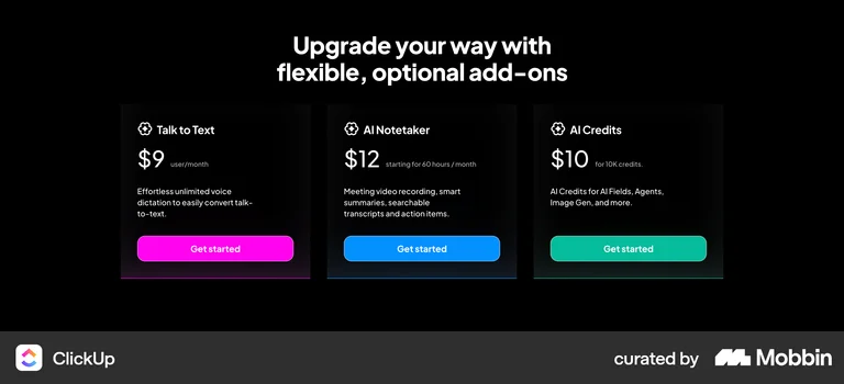
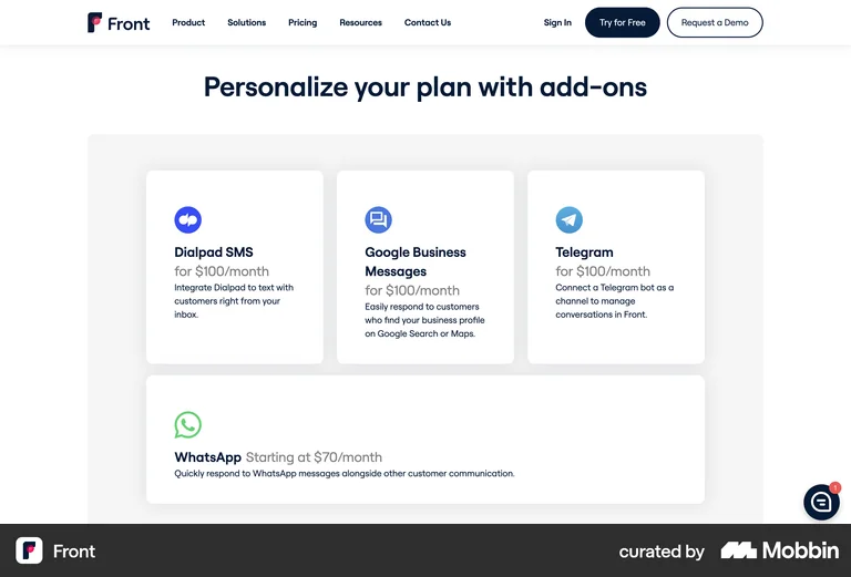
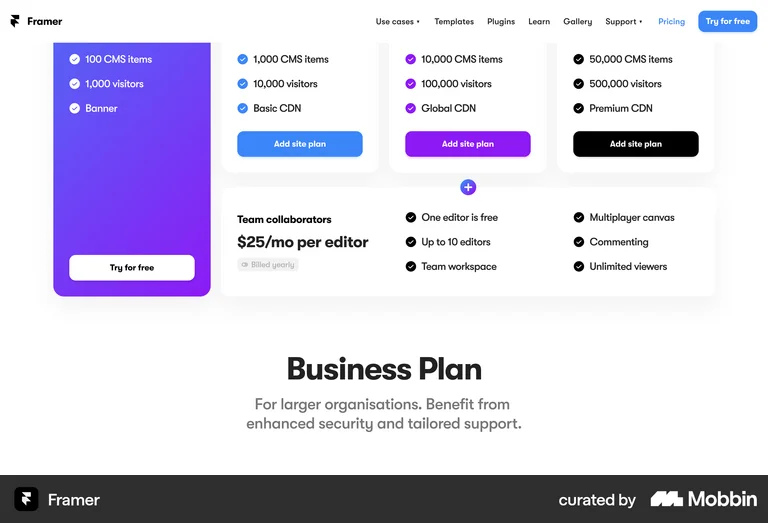
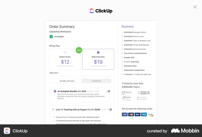
Ship a hybrid of Direction 1 and Direction 2. Keep the two-card optional-add-ons grid for its clarity and native fit under the existing plans, but give the Managed 
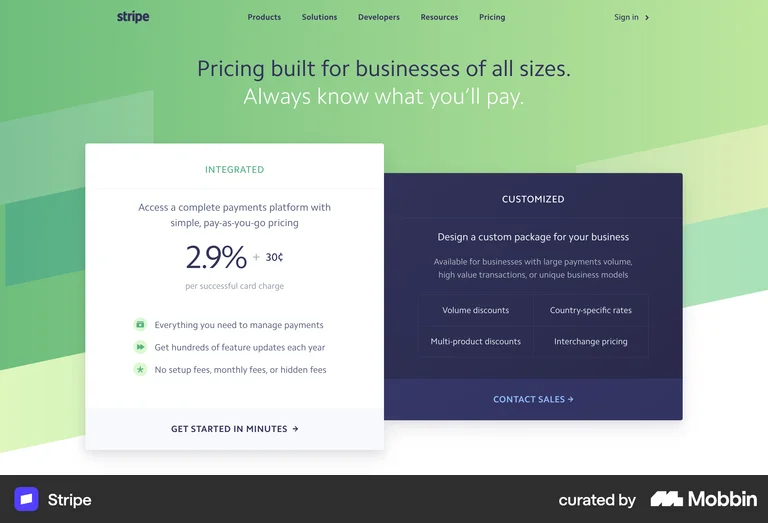
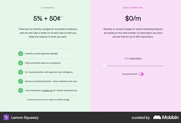
Billing card the Stripe-style "% + $" pricing typography and the "a clear 3.9% versus the usual 6 to 8%" transparency line. Leave E-prescribe as a plain self-serve card with an "Add to plan" button.

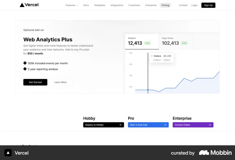
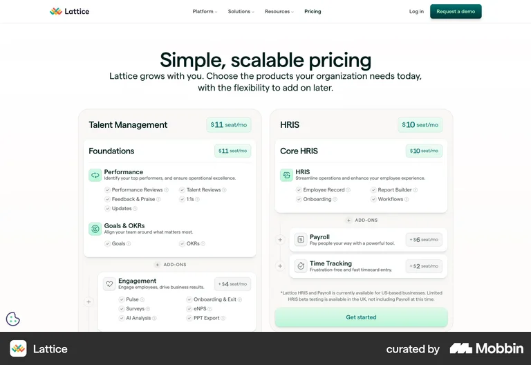
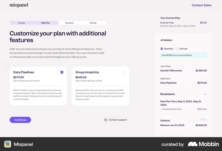
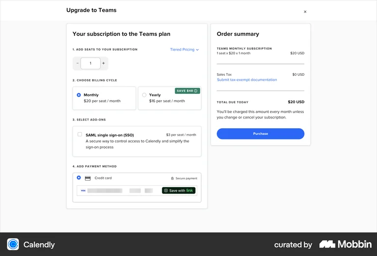
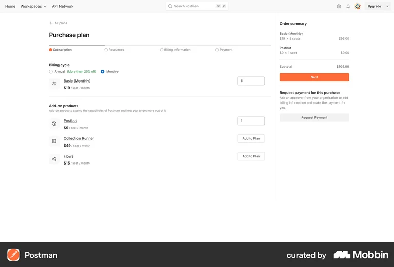
Hold the Modular direction for when add-ons become togglable per plan in-product, and the Builder for the in-app upgrade screen. A full configurator on the marketing page is heavier than the page's current style, and the variable 3.9% means a single headline total is not honest there.

On measurement: whichever ships, track add-on card clicks and the Managed Billing "Book a call" rate, so the angle can be tuned with real numbers rather than argued in the abstract.